For *ahem* comparison, here's how Slashdot's ancient "Palm" page looks on an iPhone:
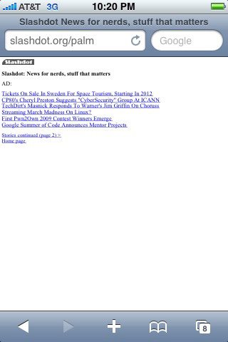
Niiiiiice.
View:
What follows is all the technical stuff you probably don't care about. :-)
Update, November 2012: Finally fixed the code a bit. It's a lot simpler now and I fixed a couple small issues and a couple big ones. The main thing now is it will always display the newest story.
Update, October 2014: If you want a much more fully-featured solution, check out Avantslash.
Note: This works pretty well on modern Android devices, too. So everywhere you see "iPhone", think "iPhone and Android". :-) (And probably Windows Phone 7 and 8 and webOS (RIP) and...)
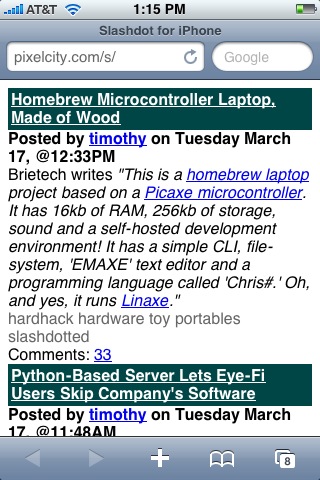
Reading Slashdot on the iPhone or BlackBerry is not as good as it could be. Also, there is no Slashdot iPhone app. The iPhone's workaround for non-mobile-opimized pages—the pan and zoom system—is fine for sites I only look at occasionally, but for something I look at as often as Slashdot, I'd like something a little better. BlackBerry's browser tries to bite off more than it can chew, so instead of ignoring the CSS and just giving users a plain 1996-style rendering of the HTML, it looks horrible. (Last I checked. It's been a while. My work took back the BlackBerry they issued me.) Since Slashdot doesn't offer a good mobile-optimized version, I whipped up my own system. Note: This doesn't replace the entire site, it's just for the front page. (Update: that is no longer true. See below.) (Update #2: never mind, it's not working out. See below.)
I started with adding css to the RSS feed but the feed (in my limited experience) seems to be often out of sync with the actual front page. So, I fell back onto Plan B: the brute-force method of downloading the actual front page and styling it for iPhone. I've got a PHP script that pulls down the page with cURL, then I use two methods to hack away everything I don't want: PHP's str_replace and 'display: none' in the style sheet. Then I add styling to the elements I want to keep. This is ugly and hackish and I don't know if it's really valid HTML (probably not) but for the most part it does what I want it to do so I'm happy with it. I'm happy to hear any suggestions for improvement. Update: someone sent in some nice code that cuts out a lot of extra code and cuts the page size roughly in half--say, from 100k to 50k. I'll put it up here as soon as I get around to taking a good look at it. But I'm busy, so don't hold your breath.
For iPhone (my main portable device) I pull the front page (the non-logged-in front page, so it might show different stuff than what you see when you're logged in) and strip out as much as I can and leave what I want. (For example, I like to see tags and the number of comments.)
For BlackBerry (work just gave me one--a Curve 8830) I just work with the RSS feed and add a bit of color to make it look Slashdot-y. I haven't put much effort into that, and won't, so if you want to do more, grab the source and go to town.
Aside: I started playing with the comment pages. Long story short: it didn't work out, so I've disabled it in the public code. Email me if you care.
For *ahem* comparison, here's how Slashdot's ancient "Palm" page looks on an iPhone:
Niiiiiice.